Cashare Agent Portal - A whole dashboard from scratch. No big deal. (jk it was a big deal)
Client
Agent Portal - Cashare AG
Year
2025
I designed an entire internal portal for Cashare, a fintech company in Switzerland. Agents needed a place to manage customers, track loans, monitor contracts, and not lose their minds doing it. So I gave them dashboards with real data, clean tables they'd actually want to look at, and an inbox that doesn't make you cry. From the first wireframe to the final pixel, this one was all me.
Scope of Work
Where it all comes together.
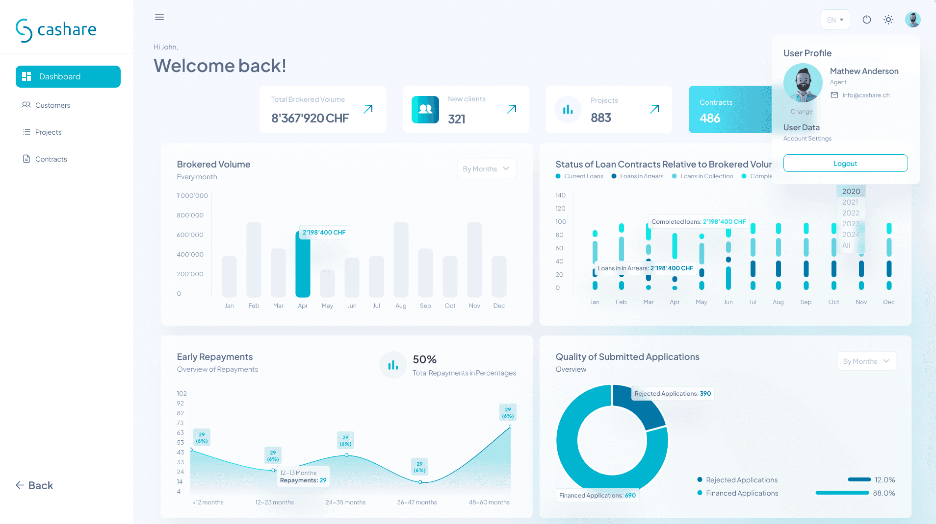
When you're building a portal for people who deal with millions in loans every day, the first thing they see when they log in matters. It has to feel like control. Like everything is accounted for, organized, and not about to fall apart. That was the goal with this one.
There's a certain comfort in seeing your numbers laid out cleanly. Bar charts that actually make sense, status indicators that tell you what's going wrong before it gets worse, and a profile sitting quietly in the corner reminding you who you are in case you forgot after staring at data for six hours.
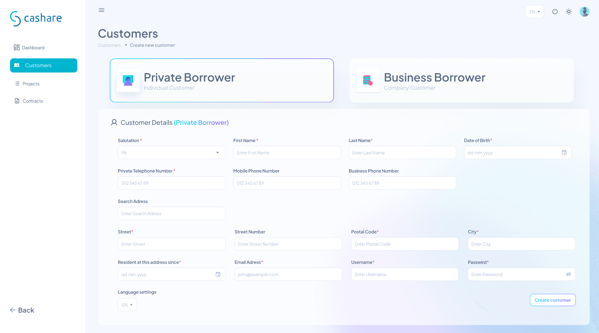
But a portal isn't just dashboards and pretty graphs. At some point, someone needs to sit down and type in a name, an address, a phone number. And that part has to feel just as considered as the flashy stuff. The kind of form where your eyes know exactly where to go next without thinking about it. Where nothing feels cramped or confusing or like it was designed by someone who's never actually filled out a form in their life.
The truth is, the boring screens are the ones that matter most. If the onboarding flow is frustrating, nobody cares how nice your dashboard looks. So I made both of them feel like they belong together. Same energy, same care, same obsessive attention to spacing that my friends think is weird but my clients appreciate.
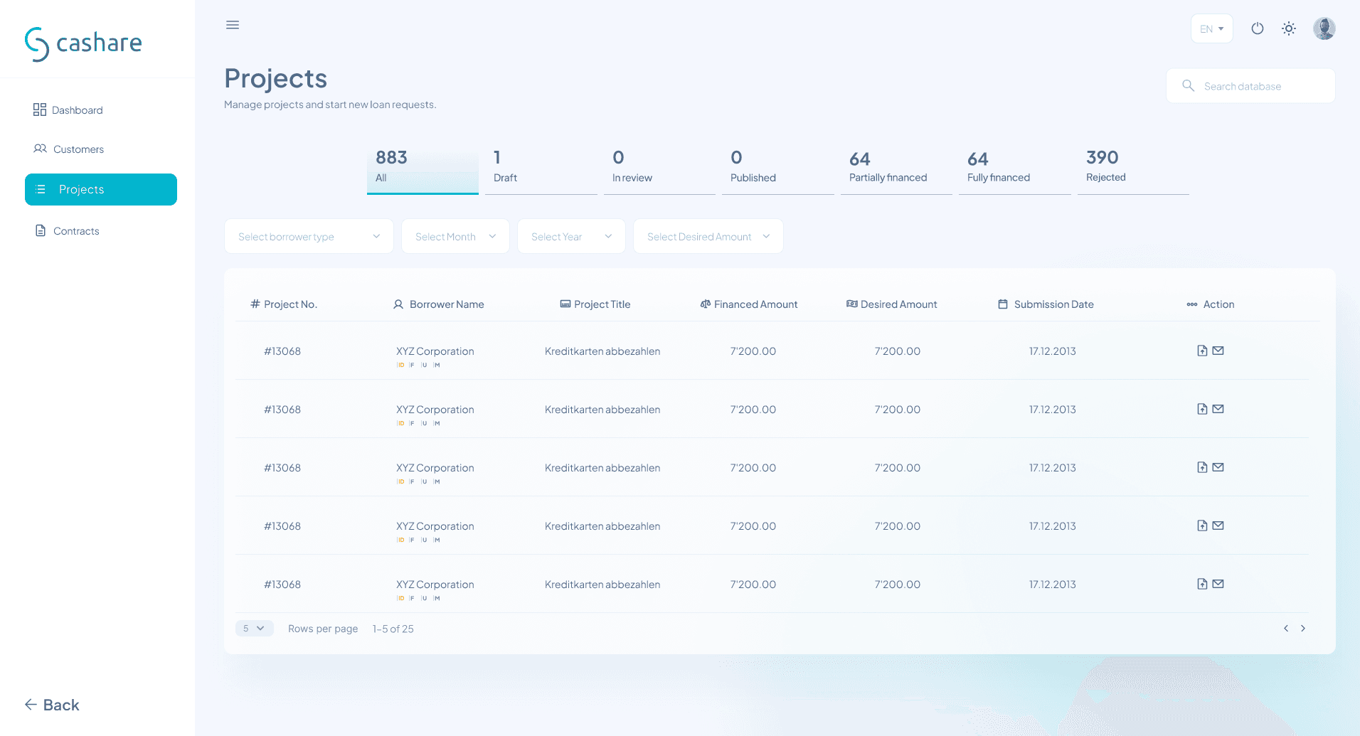

The art of making 883 things not look like chaos.
There's a moment in every data-heavy project where you zoom out and realize you're looking at hundreds of rows of information that all need to make sense to someone who didn't design it. That's the real challenge. Not making it pretty. Making it usable.
883 projects. Each one with a borrower, a title, a financed amount, a desired amount, a submission date. And someone, somewhere, needs to find the right one in under five seconds. That's not a design problem, that's a trust problem. If the table feels overwhelming, the agent doesn't trust the system. If the filters feel intuitive, they do. So I spent a lot of time on things most people would never notice. The weight of the column headers. The breathing room between rows. The way the status tabs sit above everything like a quiet summary of what's going on before you even start scrolling.
And then there's the customer list. Same idea, different data. But this one has a little something extra. Those colored badges that tell you instantly who's an agent, who's a customer, and who still hasn't uploaded their passport. There's a dropdown hiding in the corner that lets you start a new loan type with one click. Installment or bullet. Two options, no confusion.
The thing about designing tables is that everyone thinks they're boring until they have to use a bad one. Then suddenly spacing matters. Column alignment matters. Whether the action buttons are on the left or the right matters. I made sure every decision here was intentional, even the ones nobody will ever thank me for.
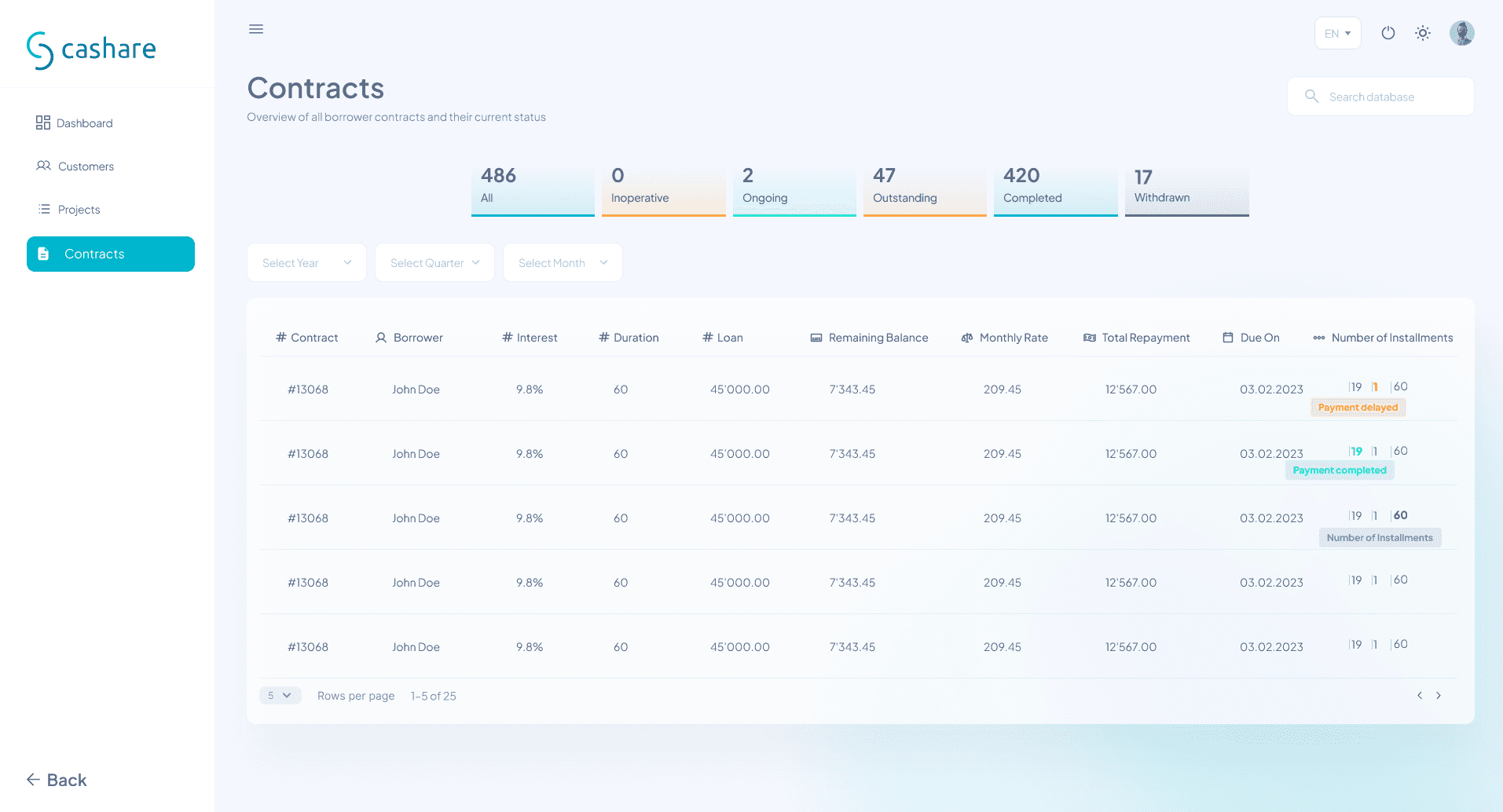

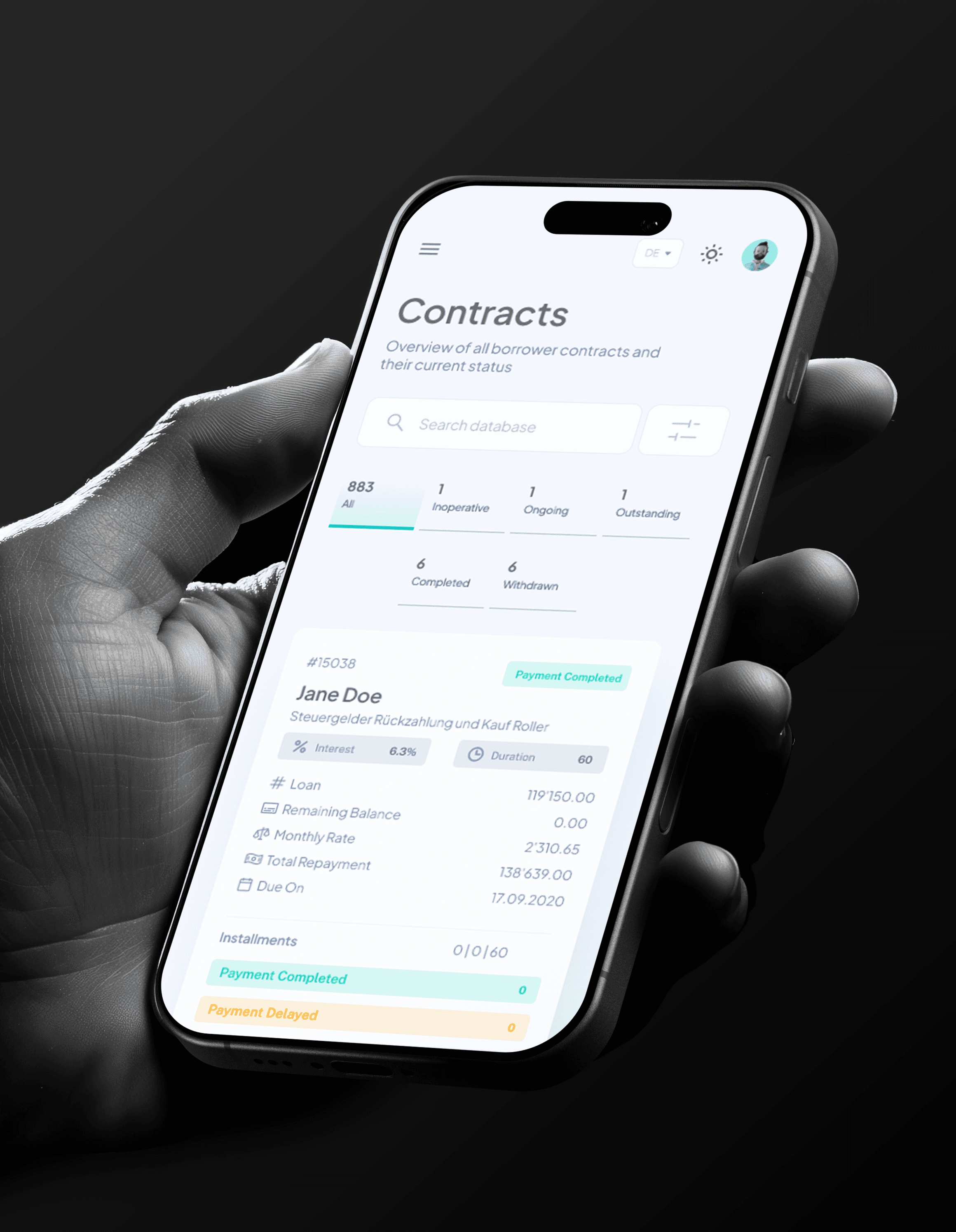
Contracts and a place for all the conversations.
There's something humbling about designing a screen that holds 486 contracts. Each row is someone's loan. Someone's house, someone's business, someone's plan for the future. And they all end up here, in a table, with an interest rate and a due date and a little colored tag that says whether the payment went through or not.
The status tabs at the top were one of those design decisions that seem simple but changed everything. Inoperative, ongoing, outstanding, completed, withdrawn. Five words that give an agent a full picture of their portfolio before they even touch the filters. And the filters themselves, year, quarter, month, just enough to narrow things down without making it feel like a science project.
I think a lot about what happens at the edges of a product. Not the hero screens or the dashboards that get all the attention, but the screens people end up on at 4pm on a Tuesday when they just need to find one contract and go home. That's where the real design work lives.
And then there's the inbox. Every portal needs one, and every inbox risks being the screen nobody wants to open. So I kept it clean. Three-panel layout: folders on the left, message list in the middle, full conversation on the right. Labels for loan updates and triggered alerts so nothing gets lost. File attachments that don't look like an afterthought. Reply and forward buttons that actually feel clickable.
It's not the most exciting screen in the portal. But it's the one that keeps people from switching to their actual email, and honestly, that's a win.

The whole portal, now in your pocket.
There's a test I do with every product I design. I shrink the browser window to phone size and see if I still feel calm. If the data still makes sense, if the buttons are still reachable, if my eyes still know where to go. Most desktop designs fail this test immediately. This one didn't.
Fitting 883 contracts into a phone screen sounds like a bad idea. But the trick isn't cramming everything in. It's knowing what to show and what to tuck away. The status tabs wrap into two rows instead of one long strip. The table becomes a card. Each contract expands into its own little world with interest rates, loan amounts, installment breakdowns, all stacked vertically instead of stretched horizontally. It reads like a story instead of a spreadsheet.
The customer onboarding form was the real challenge. On desktop, you have four fields in a row. On mobile, that becomes one field at a time, stacked, breathing, not rushing you. The form doesn't feel like it got squeezed into a smaller box. It feels like it was designed for this box. Because it was.
And then there's the customer list with all its document statuses and colored badges, somehow still legible and still usable on a screen you hold with one hand. Passport uploaded but rejected? You can see that. Form A approved? Right there. The information density didn't change. The layout did.
Responsive design isn't just resizing things. It's rethinking how information flows when the container changes. Every screen in this portal got that treatment, not as an afterthought, but as part of the design from day one.


